
The Simple Reason We Rebranded
The Simple Reason We Rebranded
Recently, we found ourselves stuck on a word. Really, we were struggling with an idea.
We were Simple Donation, and the second part of that name had begun to feel a little … limiting. Why? Well, “donation” is a fine word — a donation is a good thing — but the concept seemed like a bit of a one-off, an isolated action. A transaction, even. Nope, that's not us. Giving starts with heart, not bank accounts.
We wanted to evoke an enduring spirit. Generosity, mission, impact — the very things we focus on and help each of our partner churches achieve in their own way. Yes, one service we provide is enabling churches to process payments, but we're so much more. And, as the saying goes, sometimes you can say more with less. So, we took our brand, and made it — wait for it — Simple.
"We wanted to evoke an enduring spirit"
OK, world, meet Simple. We're the giving gateway custom built for Rock RMS and the platform purposefully designed with every end-user in mind. At our heart, we exist to build relationships and software that help people give cheerfully and meaningfully.
And here's how we do that:
- Listening: We learn about your church's specific mission and how we can partner with you to fulfill it.
- Guiding: We share knowledge and best practices drawn from hundreds of our partners in the Rock community, and we tailor advice to your unique needs.
- Freeing: With Simple's 5-minute reconciliation, clearly synced statements, and immediate deposit notifications, church leaders spend less time fiddling with the books and more time focusing on deepening people's faith journeys.
- Finding: Beyond the day-to-day, we're here to help you see the story your data tells, and how we can strategize to cement giving as a shared and enduring emphasis of your culture — not individual contributions during a campaign.
- Celebrating: With Merlin, our giving wizard, we make it easy for your members to express their generosity without stumbling through multiple logins and manual payment entries. That's a big win in the palm of your hand.
As we developed our new brand, we channeled three attributes:
- Humble: We don't chase recognition; we pursue what's best for our partner churches.
- Simple: We like to simplify processes for people, we're here to knock down hurdles to heartfelt giving.
- Relatable: We value people and relationships, and we want to help with more than just code.

You'll see these attributes — and the essence of our software and services — weaving through every aspect of our brand:
- Our new logomark, The Link, symbolizes the unity of people, purpose, and ministry. At its center, a space representing the genesis of heartfelt giving — a space shaped like a home.

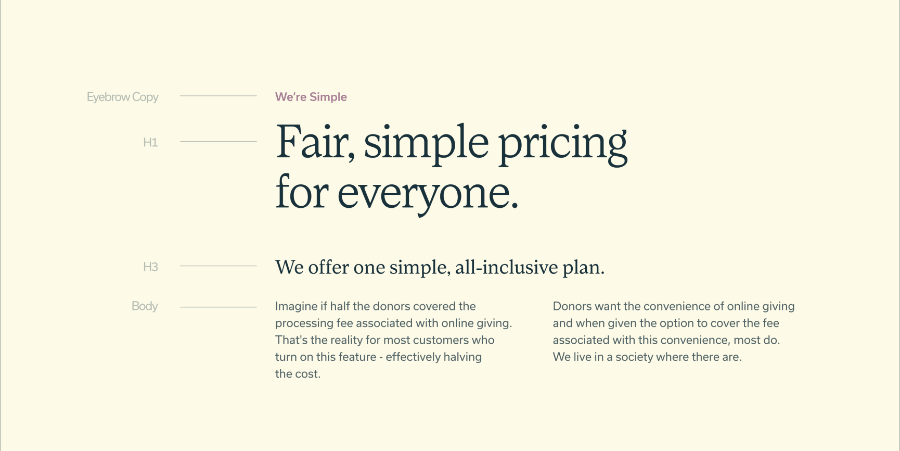
- The lowercase logotype expresses humility and relatability. It's created from the same display typeface that we use in our brand applications to create a simple and cohesive type system.
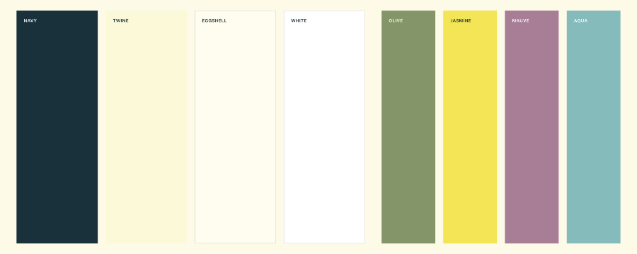
- Our new, custom colors feature Navy, Twine, and Eggshell in our primary palette. They are complemented by our secondary palette: Olive, Jasmine, Mauve, and Aqua. Together, the palettes feel grounded and evoke a calm and modest spirit. Olive in particular calls to mind thoughts of generosity.
- Refined purpose, mission, and vision statements emphasize cheerful giving, mission-aligned partnerships, and the convergence of generosity, efficiency, community impact, and people's individual faith journeys.
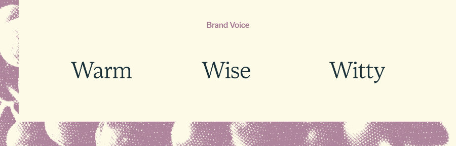
- Our reimagined brand voice plucks three chords — Warm, Wise, and Witty — to convey our true personality: a friendly partner with a ton of experience who might even make you chuckle. (Please let us know when we make you chuckle.)
- There's more to the brand, of course, and you're seeing it come alive on this very page. You'll also find it in Rock, on Merlin, and everywhere you go to hang out with Simple.
- Building this brand was a team effort. We worked with the folks at Focus Lab, where we cooked up brand strategy, honed our comms, tuned our design, and occasionally talked about college football and fishing. Who said work couldn't be fun? It should be, and it should always be meaningful.
- We've magnified meaning through this rebrand, both for our company internally, and for the wonderful partners we're proud to serve every day. The work continues. So do the smiles. Please keep an eye out for what's next from us. In the meantime, we'll keep it Simple.